History & public life · Autograph & handwriting
Leon Trotsky signature
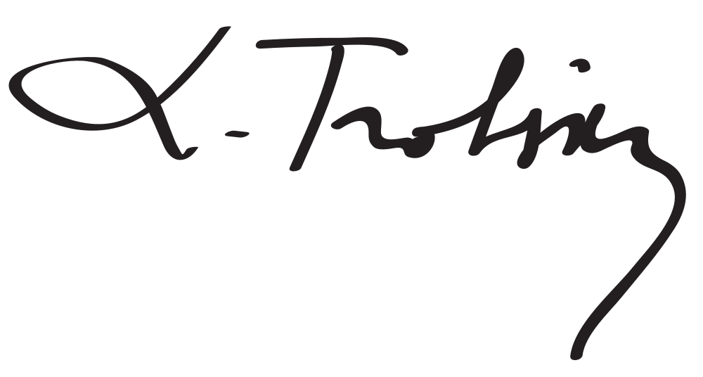
A broad fine opening loop occupies the left of this abbreviated specimen.
What does Leon Trotsky’s signature look like?
A broad fine opening loop occupies the left of this abbreviated specimen. A separate dot precedes a tall surname crossbar and smaller connected forms, ending in a long downward hook at the right.
- Slant
- +21°forward
- Baseline
- −3.3°falling
- Width / height
- 2.03 : 1overall proportions
- Opening height
- 0.68×opening versus body letters
A looped initial and a long hooked surname ending
A broad fine opening loop occupies the left of this abbreviated specimen. A separate dot precedes a tall surname crossbar and smaller connected forms, ending in a long downward hook at the right. Compare the opening’s oval with that final descent: the compact middle band sits between two much larger gestures.
Leon Trotsky signature analysis
Leon Trotsky’s signature sample has 21° of forward slant, a falling baseline and 1 enclosed loop. Use the layers to follow the writing line, letter band, slant and enclosed loops.
- Slantforward
- +21°
- Baselinefalling
- −3.3°
- Width / heightoverall proportions
- 2.03 : 1
- Opening heightopening versus body letters
- 0.68×
- Enclosed loopsclosed spaces in the image
- 1
- Ink groupsmain disconnected groups
- 4
- Ink densityinside the signature bounds
- 8.0%
- Underlineno long lower flourish
- None
- Finish heightrelative to the letter body
- −0.43×
Opening, letter body and finish
The opening is lower than the typical letter body. The opening-to-body ratio is 0.68×, while the whole image is 2.03 times as wide as it is tall. The rightmost ink finishes below the writing line; look at this ending separately from the slant of the letters themselves.
Loops and the lower flourish
The sample contains 1 enclosed loop and 4 main ink groups. The letterforms carry the main horizontal movement; there is no long lower underline detected beneath their band.
Leon Trotsky’s signature in graphology
Traditional graphology associates enlarged initial strokes with public emphasis. The long hooked ending adds expressiveness at the opposite side, framing a more economical connected centre.
Follow the forward-leaning strokes in this image alongside the smaller body letters. For another perspective on your own writing, the handwriting analysis tool brings slant, size and spacing into a full-page reading.
Signatures with similar shapes
Compare these samples’ slant, proportions and letter rhythm with Leon Trotsky’s autograph.