Arts & literature · Autograph & handwriting
Jorge Luis Borges signature
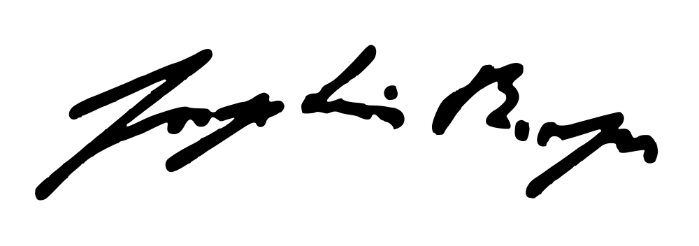
Three compact dark groups occupy this Borges specimen.
What does Jorge Luis Borges’s signature look like?
Three compact dark groups occupy this Borges specimen. Broad pointed strokes open the left and right regions, with smaller initial-like forms and a detached dot between them.
- Slant
- ≥ +40°forward
- Baseline
- −7.5°falling
- Width / height
- 4.00 : 1overall proportions
- Opening height
- 0.27×opening versus body letters
Three dark abbreviated groups with pointed openings
Three compact dark groups occupy this Borges specimen. Broad pointed strokes open the left and right regions, with smaller initial-like forms and a detached dot between them. Compare the gaps with the overlapping strokes inside each group: the autograph has a segmented construction, and its strongest gestures do not form one continuous enclosing frame.
Jorge Luis Borges signature analysis
Jorge Luis Borges’s signature sample has a forward slant at the edge of the measured range, a falling baseline and 0 enclosed loops. Use the layers to follow the writing line, letter band, slant and enclosed loops.
- Slantforward
- ≥ +40°
- Baselinefalling
- −7.5°
- Width / heightoverall proportions
- 4.00 : 1
- Opening heightopening versus body letters
- 0.27×
- Enclosed loopsclosed spaces in the image
- 0
- Ink groupsmain disconnected groups
- 5
- Ink densityinside the signature bounds
- 17.6%
- Underlinelower flourish
- 29% of width
- Finish heightrelative to the letter body
- +0.14×
Opening, letter body and finish
The opening is lower than the typical letter body. The opening-to-body ratio is 0.27×, while the whole image is 4.00 times as wide as it is tall. The rightmost ink finishes above the writing line; look at this ending separately from the slant of the letters themselves.
Loops and the lower flourish
The sample contains 0 enclosed loops and 5 main ink groups. The lower flourish spans about 29% of the full ink width, giving the name another line to follow beneath its letters.
Jorge Luis Borges’s signature in graphology
Traditional graphology associates angular forms with determination. The broad abbreviated openings give each side public emphasis, while the small middle group introduces a more economical pause in the specimen’s rhythm.
Follow the forward-leaning strokes in this image alongside the lower flourish. For another perspective on your own writing, the handwriting analysis tool brings slant, size and spacing into a full-page reading.
Signatures with similar shapes
Compare these samples’ slant, proportions and letter rhythm with Jorge Luis Borges’s autograph.