Arts & literature · Autograph & handwriting
Franz Kafka signature
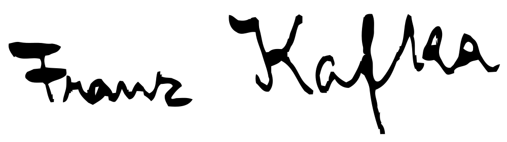
A wide detached F crossbar opens the first group.
What does Franz Kafka’s signature look like?
A wide detached F crossbar opens the first group. Small pointed forms continue toward a larger upright K in the second, with a longer descending stroke near the middle.
- Slant
- −8°backward
- Baseline
- +4.7°rising
- Width / height
- 4.09 : 1overall proportions
- Opening height
- 1.65×opening versus body letters
Angular openings and compact dark words
A wide detached F crossbar opens the first group. Small pointed forms continue toward a larger upright K in the second, with a longer descending stroke near the middle. The dark letters remain compact; compare the separate crossbar and surname opening with the low body forms to see the signature’s angular, segmented structure.
Franz Kafka signature analysis
Franz Kafka’s signature sample has 8° of backward slant, a rising baseline and 2 enclosed loops. Use the layers to follow the writing line, letter band, slant and enclosed loops.
- Slantbackward
- −8°
- Baselinerising
- +4.7°
- Width / heightoverall proportions
- 4.09 : 1
- Opening heightopening versus body letters
- 1.65×
- Enclosed loopsclosed spaces in the image
- 2
- Ink groupsmain disconnected groups
- 5
- Ink densityinside the signature bounds
- 12.7%
- Underlineno long lower flourish
- None
- Finish heightrelative to the letter body
- −0.03×
Opening, letter body and finish
The opening stays near the height of the body letters. The opening-to-body ratio is 1.65×, while the whole image is 4.09 times as wide as it is tall. The rightmost ink finishes below the writing line; look at this ending separately from the slant of the letters themselves.
Loops and the lower flourish
The sample contains 2 enclosed loops and 5 main ink groups. The letterforms carry the main horizontal movement; there is no long lower underline detected beneath their band.
Franz Kafka’s signature in graphology
Traditional graphology associates angular forms with determination. The enlarged F and K give the public name emphasis, while the compact continuation introduces the economical rhythm traditionally associated with directness.
Follow the backward-leaning strokes in this image alongside the smaller body letters. For another perspective on your own writing, the handwriting analysis tool brings slant, size and spacing into a full-page reading.
Signatures with similar shapes
Compare these samples’ slant, proportions and letter rhythm with Franz Kafka’s autograph.