Music & entertainment · Autograph & handwriting
Billie Eilish signature
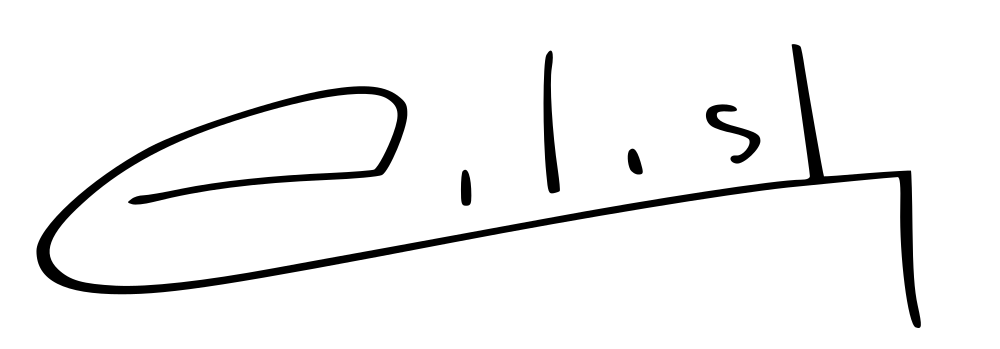
A broad open oval forms the left side of this Eilish specimen.
What does Billie Eilish’s signature look like?
A broad open oval forms the left side of this Eilish specimen. Sparse upright marks and dots sit above a long rising lower stroke, which turns sharply downward at the right.
- Slant
- −4°near upright
- Baseline
- +11.3°rising
- Width / height
- 3.12 : 1overall proportions
- Opening height
- 0.93×opening versus body letters
An open oval leads into an extended lower line
The large left-hand curve and the line beneath the letters define most of the outline. Inside that frame, the remaining marks are spaced out and comparatively simple: upright strokes, two small dots and a compact curved form. The lower stroke runs well beyond the last small letter before making its abrupt downward turn. Compare the empty space inside the opening with the much smaller spaces among those later marks. The autograph’s distinctive balance comes from a wide, open beginning and a straight, strongly extended finish rather than a densely written full name.
Billie Eilish signature analysis
Billie Eilish’s signature sample has an almost upright slant, a rising baseline and 0 enclosed loops. Use the layers to follow the writing line, letter band, slant and enclosed loops.
- Slantnear upright
- −4°
- Baselinerising
- +11.3°
- Width / heightoverall proportions
- 3.12 : 1
- Opening heightopening versus body letters
- 0.93×
- Enclosed loopsclosed spaces in the image
- 0
- Ink groupsmain disconnected groups
- 5
- Ink densityinside the signature bounds
- 7.3%
- Underlinelower flourish
- 92% of width
- Finish heightrelative to the letter body
- −0.90×
Opening, letter body and finish
The opening stays near the height of the body letters. The opening-to-body ratio is 0.93×, while the whole image is 3.12 times as wide as it is tall. The rightmost ink finishes below the writing line; look at this ending separately from the slant of the letters themselves.
Loops and the lower flourish
The sample contains 0 enclosed loops and 5 main ink groups. The lower flourish spans about 92% of the full ink width, giving the name another line to follow beneath its letters.
Billie Eilish’s signature in graphology
In traditional graphology, a sweeping lower stroke is read as emphasis and a wish to give the name presence. The wide opening adds an expressive gesture, while the sparse letter marks provide a more economical counterpoint. Read those contrasting parts of this specimen together rather than treating its long outline as uniformly elaborate.
Follow the near-upright strokes in this image alongside the lower flourish. For another perspective on your own writing, the handwriting analysis tool brings slant, size and spacing into a full-page reading.
Signatures with similar shapes
Compare these samples’ slant, proportions and letter rhythm with Billie Eilish’s autograph.